Tuesday, February 28, 2017

Delicious Desserts, Inspired by Wayne Thiebaud

After exploring color mixing by creating new colors and naming them, 3rd grade artists looked at and discussed the work of American painter Wayne Thiebaud. Thiebaud (pronounced "tee-bow") is known for his paintings of everyday objects, like food, and still makes art today. 
Wayne Thiebaud, Cakes (1963)
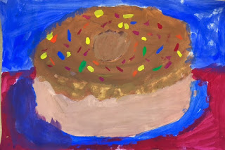
We looked at his paintings of different kinds of desserts and noticed his use of bright colors and dramatic, colorful shadows. Looking at several examples made us hungry! To begin our own paintings of desserts, we looked at the geometric shapes and forms that make up a lot of our favorite desserts. We noticed that many desserts are either a cylinder, like a cake or pie; a cone shape, like an ice cream cone; a sphere, like the scoop of ice cream; or a triangular prism, like a slice of cake. We brainstormed and drew a few sketches of our favorite desserts before selecting one to sketch out on larger paper, focusing on the shapes. 
The following class, we used our recent experience with mixing colors to paint our favorite desserts! We thought about how we could mix a variety of colors, thinking about the bright colors that Thiebaud uses in his painting, as well as using white to create lighter tints of a color. 
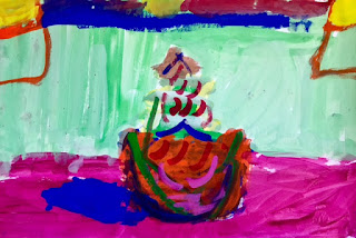
Students painted their desserts, incorporating tints, and the following week, they added additional details on top, now that the first layer of paint had dried. Students thought about how they could decorate their cakes, ice cream cones, sundaes and doughnuts with creative details like frosting, sprinkles, flowers, candles and hot fudge. 
During the next class, students painted the background, considering the use of a complementary colors and colors that would help their desserts to stand out. Since Thiebaud is also known for his use of strong shadows, we looked at cast shadows and how the shape of the object changes the shape of the shadow. Students added a colorful shadow to their dessert, and many students actually chose to add a window in their background to show a light source. 
For our last class, students participated in a gallery walk to see everyone's artwork and also a turn and talk to share their work with a partner. Here are some colorful examples of our delectable Wayne Thiebaud inspired desserts:
Andrew, 3rd Grade (Monfette)
Artem, 3rd Grade (Stone)
Brixton, 3rd Grade (Stone)
Desmond, 3rd Grade (Fletcher Nickl)
Evan, 3rd Grade (Monfette)
Gavin, 3rd Grade (Fletcher Nickl)
Pedro, 3rd Grade (Monfette)
Priya, 3rd Grade (Monfette)
Siobhan, 3rd Grade (Fletcher Nickl)
Yulissa, 3rd Grade (Monfette)
Zerihun, 3rd Grade (Fletcher Nickl)

Manos, 3rd Grade (Monfette)

Sunday, February 26, 2017

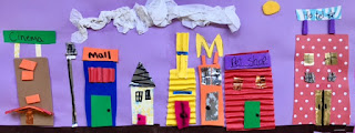
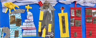
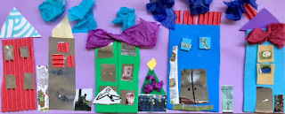
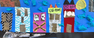
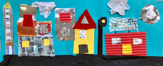
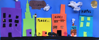
Romare Bearden Inspired 'My Block' Cityscape Collage

After their Pop Art inspired print project, 4th grade artists looked at the work of another American artist named Romare Bearden. An African American artist, Bearden lived and worked in Harlem, a neighborhood in New York City. We looked at and discussed one of his collage artworks called "The Block." 
Romare Bearden, The Block (1978)
Students noticed that there were many different buildings and details -- windows, people, signs, etc. Students also noticed that some of the buildings looked like they were made of different materials, such as brick. We discussed how the street in a city is very busy, with many different kinds of buildings, such as apartments, restaurants, and stores. We noted that although you can tell that it is a city street, some of the colors, proportions, and views are not completely realistic. For example, some parts of the buildings are cut out so that you can see what is happening inside, and the light bulb in one of the rooms is much larger than the people around it. The longer we looked at it, the more there was to see! 
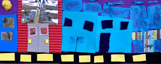
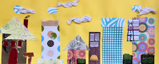
Then we began our own mixed media collage artwork, using a long piece of construction paper to start the city street. We talked about what kinds of buildings students could add, and how to overlap and layer different materials together to add detail and interest to our street. There were many different materials to choose from, including construction paper, corrugated paper, metallic paper, fabric, felt, tissue paper and foam. Students thought carefully about what other details they could add to their street, such as traffic lights and stop signs. 
After they were done with their mixed media collage, students used a skinny Sharpie to add details such as window frames, bricks, and signs for different buildings. At the end of our project, we did a gallery walk so we could see everyone's work.
Many students were proud of specific details in their mixed media collage, and their use of a particular material. Some students found it challenging to work with the fabric and felt materials and add the level of detail they wanted with them. Below are some examples of our finished collage city streets, inspired by Romare Bearden. 
Aleks, 4th Grade (Dubuque)
Andrew P., 4th Grade (Doherty)
Bruno, 4th Grade (Mattson)
Dorie, 4th Grade (Doherty)
Emily, 4th Grade (Doherty)
Emma B., 4th Grade (Mattson)
Gabe, 4th Grade (Cikacz)
Gustavo, 4th Grade (Graves)
Jack, 4th Grade (Mattson)
Jaylyn, 4th Grade (Dubuque)
Lialah, 4th Grade (Cikacz)
Liliana, 4th Grade (Cikacz)
Max T., 4th Grade (Graves)
Max H., 4th Grade (Mattson)
Sona, 4th Grade (Doherty)

Monday, February 13, 2017

Warm and Cool Color Mittens

Hope everyone is having a good snow day! PK and Kindergarten artists recently learned about warm and cool colors. We learned that warm colors, like red, orange, and yellow, remind us of warm things like fire and the sun. On the other hand, cool colors, like green, blue and violet, remind us of cool things like water and the sky. We looked at pictures of different objects and identified whether they were cool or warm colors. 
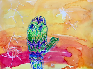
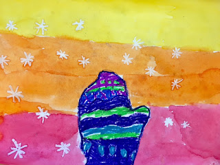
Then we used warm and cool colors in our artwork. Kindergarten students used their hand to create a mitten shape and outline it on their paper. PK students traced the shape of their hand. Then, if they sat at a warm color table, they used oil pastels in warm colors to color in their mitten and if they sat at a cool color table, they used cool colors. 
Kindergarten students used a variety of different lines and shapes to add patterns and designs to their mitten to make them colorful and interesting. Students also added snowflakes around the mitten, using white oil pastel, which was a little hard to see but would be revealed next class! PK students focused on coloring and covering all of the white paper inside their hand.
The following class, students who had used warm color oil pastels used watercolor paint in cool colors to paint over and around their mitten or hand. For Kindergarten students, the paint also helped reveal their snowflakes! 
The oil pastel and watercolor paint do not mix together so you can still see what you drew with the oil pastel, even after you add paint on top. This effect is called resist, since the two materials do not mix together but move apart. Here are a few examples of our warm and cool color hands and mittens:
Christina, PK (Mattson)
Clara, PK (Mattson)
Declan, PK (Mattson)
Sagan, PK (Mattson)
Jacob, PK (Mattson)
Aurelia, Kindergarten (Bolton)
Ethan, Kindergarten (Segreve)
Ava, Kindergarten (Tan)
Kiana, Kindergarten (Blackwood)
Rubina, Kindergarten (Blackwood)
Noah, Kindergarten (Bolton)
Matthew, Kindergarten (Martignetti)
Seta, Kindergarten (Tan)
Maya, Kindergarten (Blackwood)
Nirvaan, Kindergarten (Blackwood)