Showing posts with label Landscape. Show all posts

Sunday, April 29, 2018

Arts Around the World: French Pointillist Paintings Inspired by Seurat

The third country on our Arts Around the World journey this year is France. We began by learning about France and French artist, Claude Monet. Monet began the Impressionist art movement and we made paintings inspired by his many paintings of a bridge over a pond of waterlilies in his garden in Giverny.
Georges Seurat, A Sunday Afternoon on the Island of La Grande Jatte (1884-86)
For our next project based on a French artist, we looked at the work of Georges Seurat. We looked at Seurat's painting, A Sunday Afternoon on the Island of La Grande Jatte, and noticed that many people were out in a park, sitting and standing on the grass and boating in the water. We also noticed that it was hard to see details on the people's faces and when you look closely at the trees and water, especially, they look very soft and seem to be made up of smaller dots or brushstrokes.
A detail from Seurat's Circus Sideshow (1887-88)
Georges Seurat was born in Paris in 1859 and studied to be an artist. Seurat and painter friend, Paul Signac, developed a technique of painting called Pointillism. Pointillism uses small, distinct dots of color to form an image. The eye and mind of the viewer have to blend the dots to form new colors and see the image all together. This is actually similar to the way computer screens work today -- the pixels in the computer screen are like the dots in a Pointillist painting. Pointillism took longer than the quick brushstrokes that we learned about with Impressionism, since it involves making so many dots. A Sunday Afternoon on the Island of La Grande Jatte took Seurat two years! 
Georges Seurat, La Seine à la Grande-Jatte (1888)
We looked at several examples of Seurat and Signac's Pointillist paintings and noticed that they liked to paint landscapes, especially with water. We drew our own landscapes, inspired by the paintings we saw. Two of the second grade classes looked at the painting above by Seurat, La Seine à la Grande-Jatte, which features the Seine River that runs through Paris. We noticed that the landscape featured a river, grass, trees and sky, so we included those elements in our own landscapes. Some students added buildings, clouds or a boat, as optional details. 
Paul Signac, The Port, Red Sunset (1906)
The other two second grade classes looked at the painting above by Paul Signac, The Port, Red Sunset, and drew a sunset scene with water and sky and a setting sun. We felt it was rather simple to draw, but knew that it would be important to mix different color dots together to give the impression of a sunset and that would take more time.
The following class, students began painting their Pointillist landscapes using cotton swabs to create the dots! We dipped the end of the cotton swab into paint and pressed it onto the paper to create the dots, repeating this motion several times until we filled up an area. We tried to use different colors in the same area, the way Seurat and Signac did. 
While we were creating the dots we listened to Claude Debussy's Clair De Lune and a few more of his compositions since we have been learning about him in music. One student noticed that he shares the same first name as Claude Monet! 
Although the painting part took much longer than when we made our Impressionist inspired artwork, many students enjoyed the repetitive nature of dotting with the cotton swabs! Students who finished their Pointillist landscape paintings early were able to make their own Pointillist paintings with subjects and designs of their choice. Also, during spring break, one of our 2nd grade artists found an example of Pointillism at the Museum of Fine Arts in Boston:
Below are examples of our Pointillist landscape paintings:
Anthony, 2nd Grade (Hinds)
Ava W., 2nd Grade (Hinds)
Brook, 2nd Grade (Pearse)
Hannah, 2nd Grade (Pearse)
Lucas, 2nd Grade (Pearse)
Mary Kate, 2nd Grade (Hinds)
Norah, 2nd Grade (Pearse)
Willow, 2nd Grade (Hinds)
Ava A., 2nd Grade (O'Connor)
Dahlia, 2nd Grade (O'Connor)
Emma, 2nd Grade (Stone)
Maria A., 2nd Grade (Stone)
Maria O., 2nd Grade (O'Connor)
Mary, 2nd Grade (Stone)
Megan, 2nd Grade (Stone)
Noah, 2nd Grade (Stone)

Thursday, March 22, 2018

Monochromatic Tints & Shades Landscapes

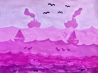
Continuing our study of value, 5th grade artists explored tints and shades of colors. Tints are made by adding white to a color and shades are made by mixing black with the color. We began by practicing mixing our shade and tints, choosing three different colors to explore. 
We also learned about the concept of atmospheric perspective, which can be seen in many landscape photographs and paintings. Atmospheric perspective describes the effect of objects being lighter in color as they get further away from you, and darker in color when they are closer. In addition, you can see more detail in the foreground and less detail in the background. We looked at some examples of photographs and paintings that demonstrate this concept. 
We discussed how landscapes can be organized with a foreground in the front, middle ground, and background. We looked at different examples of landscapes, including rural or countryside landscapes, urban cityscapes, and even fantasy landscapes inspired by books and video games. Students sketched a landscape of their own creation, including more details in the foreground, and numbering their layers to match the tints and shades gradients they painted earlier. 
The following class, students chose just one color to use for their tints and shades in their artwork, based on their explorations. When artists use shades and tints of the same color in their artwork, it is called monochromatic. 
Students began painting the background or the lightest layer first, and then painted each layer a darker tint until they arrived to their color and their shade. We discussed keeping the details as silhouettes, or outlines of the shapes. Here are some examples:
Bella, 5th Grade (Psychoghios)
Aiden, 5th Grade (Twomey)
Nolan, 5th Grade (Twomey)
Anna, 5th Grade (Twomey)
Sona, 5th Grade (Twomey)
Aliana, 5th Grade (Twomey)
Jack, 5th Grade (Twomey)
Emily, 5th Grade (Twomey)
Cammy, 5th Grade (Twomey)
Domenic, 5th Grade (Domermuth Fantasia)
Miah, 5th Grade (Domermuth Fantasia)
Yazmin, 5th Grade (Bellis)
Sila, 5th Grade (Bellis)
LiaLah, 5th Grade (Bellis)
Kate S., 5th Grade (Bellis)
Tristan, 5th Grade (Bellis)

Thursday, February 1, 2018

David Hockney Inspired Countryside Landscapes

After our Romare Bearden inspired mixed media collage cityscapes, 4th grade artists looked at and discussed the colorful countryside landscapes of British artist, David Hockney. We looked at a few examples of his landscape paintings, including the one below. 
David Hockney, North Yorkshire (1997) 
Students noticed that in comparison to the urban cityscape, Hockney's country landscapes had a lot more fields, hills, trees and details like bales of hay. Students also noticed that Hockney used some very bright colors that are not necessarily natural to a landscape. In the painting above, many students thought the purple lines represented a river, while others thought it was a road. Students also noticed that Hockney included different lines, patterns and textures to add interest to the landscape. Even areas that are all green contain different marks to show the texture of the grass. 
Students spent one class exploring color mixing, mixing different colors by combining two colors together, then three colors together, and even four. We noticed that when you mixed four colors together, they often got a little muddy. Students thought about colors they might want to use in their landscape painting. 
The following class, students sketched out their own countryside landscape, focusing on using lines to create different areas for color. They painted in the different areas of their landscape, mixing their own colors and including at least one tint, or a color mixed with white. Students referred to their color mixing experiments to help mix new colors. 
After this layer of paint dried, during the following class we added patterns on top of the different areas, such as stripes, polka dots, and various lines and shapes. We talked about complementary colors and how you might use these colors for the patterns to help provide contrast with the background color. 
Using smaller brushes, students also added details such as trees, houses, animals, cars, clouds, etc. We talked about how using the smaller brushes can really help with painting small details and sometimes it is about choosing the right tools for the job to make it easier. Students used many different colors and patterns and included details such as animals, barns, trees and fences. Below are examples of our colorful David Hockney inspired landscape paintings.
Artem, 4th Grade (Mattson)
Ethan, 4th Grade (Mattson)
Evey, 4th Grade (Doherty)
Tatiana, 4th Grade (Mattson)
Zarisha, 4th Grade (Doherty)
Desmond, 4th Grade (Graves)
Destanie, 4th Grade (Cikacz)
Gavin, 4th Grade (Graves)
Gustavo, 4th Grade (Doherty)
Jackie, 4th Grade (Cikacz)
Jayden, 4th Grade (Graves)
Maya, 4th Grade (Graves)
Meba, 4th Grade (Mattson)
Pavlos, 4th Grade (Graves)
Sofia, 4th Grade (Mattson)
Vardges, 4th Grade (Doherty)