Showing posts with label Color. Show all posts

Tuesday, February 27, 2018

Warm and Cool Color Hands & Mittens

PK and Kindergarten artists recently learned about warm and cool colors. We learned that warm colors, like red, orange, and yellow, remind us of warm things like fire and the sun. Cool colors, like green, blue and violet, remind us of cool things like water and the sky. We looked at pictures of different objects and identified whether they were cool or warm colors. Then we used warm and cool colors in our artwork. 
Kindergarten students used their hand to create a mitten shape and outline it on their paper. PK students traced the shape of their hand. Then, if they sat at a warm color table, they used oil pastels in warm colors to color in their mitten and if they sat at a cool color table, they used cool colors. Kindergarten students used a variety of different lines and shapes to add patterns and designs to their mitten to make them colorful and interesting. PK students focused on coloring and covering all of the white paper inside their hand. 
The following class, Kindergarten students added snowflakes around their mitten, using white oil pastel, which was a little hard to see but would be revealed during the next step! Then students who had used warm color oil pastels used watercolor paint in cool colors to paint over and around their mitten or hand. For Kindergarten students, the paint also helped reveal their snowflakes! 
The oil pastel and watercolor paint do not mix together so you can still see what you drew with the oil pastel, even after you add paint on top. This effect is called resist, since the two materials do not mix together but move apart. Here are a few examples of our warm and cool color mittens:
Andrew S., Kindergarten (Martignetti)
Clara, Kindergarten (Bolton)
Miguel, Kindergarten (Beatty)
Caroline, Kindergarten (Beatty)
Sorayah, Kindergarten (Blackwood)
Beatrix, Kindergarten (Blackwood)
Alejandro, Kindergarten (Martignetti)
Emily B., Kindergarten (Bolton)
Astrid, Kindergarten (Segreve)
Emily B., Kindergarten (Segreve)
Cristina, Kindergarten (Tan)
David, Kindergarten (Beatty)

Thursday, February 1, 2018

David Hockney Inspired Countryside Landscapes

After our Romare Bearden inspired mixed media collage cityscapes, 4th grade artists looked at and discussed the colorful countryside landscapes of British artist, David Hockney. We looked at a few examples of his landscape paintings, including the one below. 
David Hockney, North Yorkshire (1997) 
Students noticed that in comparison to the urban cityscape, Hockney's country landscapes had a lot more fields, hills, trees and details like bales of hay. Students also noticed that Hockney used some very bright colors that are not necessarily natural to a landscape. In the painting above, many students thought the purple lines represented a river, while others thought it was a road. Students also noticed that Hockney included different lines, patterns and textures to add interest to the landscape. Even areas that are all green contain different marks to show the texture of the grass. 
Students spent one class exploring color mixing, mixing different colors by combining two colors together, then three colors together, and even four. We noticed that when you mixed four colors together, they often got a little muddy. Students thought about colors they might want to use in their landscape painting. 
The following class, students sketched out their own countryside landscape, focusing on using lines to create different areas for color. They painted in the different areas of their landscape, mixing their own colors and including at least one tint, or a color mixed with white. Students referred to their color mixing experiments to help mix new colors. 
After this layer of paint dried, during the following class we added patterns on top of the different areas, such as stripes, polka dots, and various lines and shapes. We talked about complementary colors and how you might use these colors for the patterns to help provide contrast with the background color. 
Using smaller brushes, students also added details such as trees, houses, animals, cars, clouds, etc. We talked about how using the smaller brushes can really help with painting small details and sometimes it is about choosing the right tools for the job to make it easier. Students used many different colors and patterns and included details such as animals, barns, trees and fences. Below are examples of our colorful David Hockney inspired landscape paintings.
Artem, 4th Grade (Mattson)
Ethan, 4th Grade (Mattson)
Evey, 4th Grade (Doherty)
Tatiana, 4th Grade (Mattson)
Zarisha, 4th Grade (Doherty)
Desmond, 4th Grade (Graves)
Destanie, 4th Grade (Cikacz)
Gavin, 4th Grade (Graves)
Gustavo, 4th Grade (Doherty)
Jackie, 4th Grade (Cikacz)
Jayden, 4th Grade (Graves)
Maya, 4th Grade (Graves)
Meba, 4th Grade (Mattson)
Pavlos, 4th Grade (Graves)
Sofia, 4th Grade (Mattson)
Vardges, 4th Grade (Doherty)

Friday, January 12, 2018

Creative Color Mixing and Naming

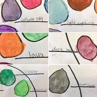
Recently artists in 3rd grade explored color mixing in preparation for an upcoming project! We mixed 10 different colors and also came up with a unique name for each color. 
First, students explored color mixing, trying to come up with 10 different colors for their palette. We discussed how you might try to create a color that you already have in mind, like a light pink, or just see what happens if you mix a lot of yellow, a little blue, and some white. Since we had just painted a color wheel with primary, secondary and tertiary colors, students were familiar with which colors to mix together to get a wide range of colors. We also experimented with adding white and black to colors, noting how it made colors lighter or darker. 
The following class, students thought of creative names for each of the colors they had made. Instead of simply naming colors "light pink" or "dark blue," students were challenged to come up with creative names like "cotton candy pink" and "ocean blue." We looked at examples of paint chips and noticed that many names were inspired by animals, nature, food, and the weather. We made a list of things we might be inspired by for color naming and then named all of our colors. We shared our paint colors and corresponding names with partners and then with the whole class. A lot of students used alliteration, which is when you repeat the same letter at the beginning of your words, like "pig pink" and "grass green." Check out some of our creative color names below!

Thursday, November 30, 2017

Pumpkins Painting

3rd grade artists painted pumpkins this fall! We began by exploring the color orange. We recalled that to make orange, a secondary color, you mix red and yellow, which are primary colors. We noticed that there are actually many different kinds of orange. We experimented with what might happen if we added more yellow or more red. We also used white to make tints of orange, and black to make shades of orange. We tried to see how many different kinds of orange we could mix, and painted them on paper. 
The following class, we got our orange explorations back and cut out shapes from the colors we created. We discussed the difference between geometric and organic shapes and students cut out both kinds of shapes. We glued them to a larger mural, trying to show the wide variety of orange. We organized the pieces so it went from light to dark. 
Now that we knew how to mix many different kinds of orange, we began to paint pumpkins! Students drew a pumpkin that was placed in the middle of their table -- big thanks to Ms. Patashnick, our music teacher, for the pumpkins! Looking carefully at its shape and lines, students drew their pumpkin from observation. We noticed the lines of the pumpkin followed its curved shape, which made our pumpkins look more round. 
The following class, students looked at the pumpkins again and noticed that there are lighter areas where the light hits the pumpkin and darker areas that are in shadow. Thinking back to the lighter and darker oranges they had mixed, students painted their pumpkins from observation, noting where it was lighter and darker on their pumpkin. We also mixed greens for the stem. 
We also included the shadow that the pumpkin cast on the table. We noticed that it was darkest closest to the pumpkin, and a curved shape similar to the pumpkin. Students mixed a darker color to use for the shadow, and also painted the background so that the pumpkin looked like it was sitting on something. Below are some examples of our painted pumpkins!
Aaron, 3rd Grade (Monfette)
Ellian, 3rd Grade (Monfette)
Elizabeth, 3rd Grade (DeBaie & Nickl)
Evelyn, 3rd Grade (Fletcher)
Finnley, 3rd Grade (Fletcher)
Isabel, 3rd Grade (Fletcher)
Lily, 3rd Grade (Fletcher)
NJ, 3rd Grade (DeBaie & Nickl)
Wyatt, 3rd Grade (Donato)
Kemi, 3rd Grade (Donato)
Noah, 3rd Grade (Donato)
Willa, 3rd Grade (Donato)