Wednesday, April 8, 2015

Watertown School District Annual Art Show


The Watertown Public Schools Annual Art Exhibition is taking place this month, from April 11th - April 27th. There will be a reception for students and families on Monday evening, April 13th, from 6-8pm. Please join us!

Tuesday, April 7, 2015

Endangered Animals of the Amazon Rainforest

2nd grade has been learning about the Brazil across different subjects, including art. We started by looking at the Amazon Rainforest, 60% of which is located in Brazil. Specifically, we looked at the endangered animals of the Amazon Rainforest and talked about what it means to be endangered. These animals include the hyacinth macaw, jaguar, poison dart frog, golden lion tamarin monkey, and the three-toed sloth.
We began by learning about the Amazon Rainforest and its environment and climate, as well as reasons why certain animals are endangered there. For example, the jaguar is endangered because people hunt them for their fur and the trees that are home to the three-toed sloth and poison dart frog are being cut down.

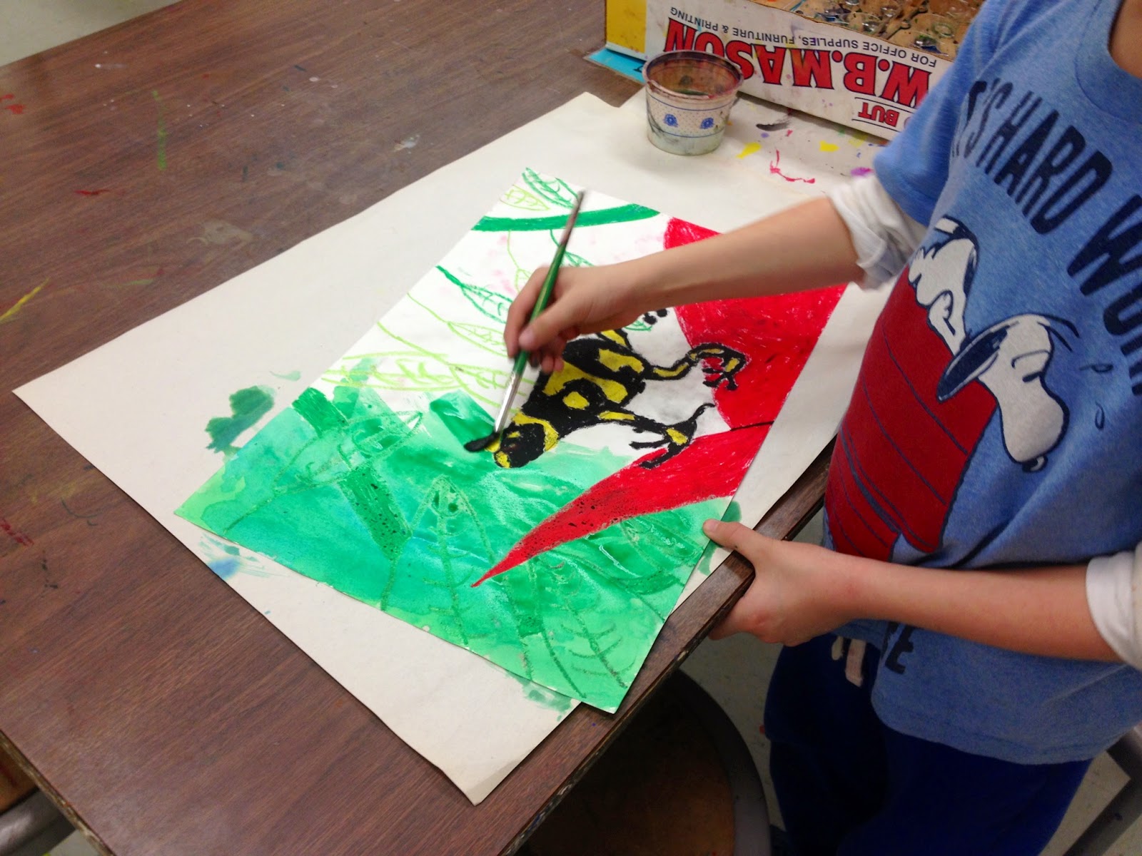
Students selected one animal to sketch, using reference images, and drew the animal it its rainforest habitat. Using oil pastels, students added color and thought about the texture of their chosen animal. 
During the following class, students added select details to the background to suggest the Amazon rainforest, such as leaves, branches, and vines. Then they painted over their oil pastel drawing with liquid watercolor to create a resist, since the oil pastel and watercolor paint do not mix.
As a conclusion to the project, students participated in a turn and talk, where they discussed their artwork with a partner using special fortune tellers to help start the conversation. 
We also came up with titles for our work and had a gallery walk to see everyone's finished artwork. Students shared their observations afterwards, noticing that everyone included the rainforest environment in their backgrounds and focused on the texture and pattern on their animal's body. Here are some finished examples:
Zach, 2nd Grade
Emma, 2nd Grade
Jaylyn, 2nd Grade
Jefferson, 2nd Grade
Kate, 2nd Grade

Friday, April 3, 2015

Exploring Texture Two Ways

Recently, PK artists have been learning about texture, or how something feels to touch. To further explore different textures, we made texture rubbings as well as texture prints!

We learned how to make a texture rubbing by placing an object underneath their paper and using the side of a crayon to rub on top of the paper to capture the object's texture. Students were given a variety of different objects at their table and experimented with texture rubbing. 
Students thought about where to place their objects underneath their paper so that they could fill up their whole paper, as well as layer some rubbings on top of each other. Here are some examples of our texture rubbing exploration:
Camden, PK
Katherine, PK
The following class, PK explored texture printing! We printed with cardboard earlier this school year but this time, students tried printing with a variety of different everyday objects and materials, as well as different colors of paint!

First, we reviewed how we make a print with an object: dip it in the paint, press it down on the paper, and lift up to reveal the print. Then students chose either a black or white piece of paper and started printing at their assigned table. Every few minutes, students moved to another table to print with different materials and paint colors. Everyday objects included sponges, forks, rubber bands, bubble wrap, toilet paper rolls, plastic mesh, spools and plastic caps. Prints were layered on top of each other as students moved around the room.
PK students did a great job with this messy process, making sure to put their objects back in the middle of the table and walking carefully to the next station with their artwork when it was time. It was pretty messy, but also a lot of fun!
Here are some examples of our texture printing exploration:
Calvin, PK
Eloise, PK
Ava, PK
Morgen, PK

Tuesday, March 31, 2015

Wayne Thiebaud Inspired Dessert Paintings

After exploring color mixing recently, 3rd grade artists looked at and discussed the work of American painter Wayne Thiebaud. Thiebaud (pronounced "tee-bow") is known for his paintings of everyday objects, like food.
Wayne Thiebaud, Cakes (1963)
Wayne Thiebaud, Four Cupcakes (1971)

We looked at his paintings of different kinds of desserts and noticed his use of bright colors -- even in some of the shadows. They are often painted on a white or plain background without a lot of detail, so the focus is really on the dessert. Looking at several examples made us hungry!
Wayne Thiebaud, Four Ice Cream Cones (1964)
To begin our own paintings of desserts, we looked at the geometric shapes and forms that make up a lot of our favorite desserts. They can be broken down into basic shapes to start, and then decorative elements and color can be added.
We brainstormed and drew a few sketches of our favorite desserts before selecting one to sketch out on larger paper. The following class, we used our recent experience with mixing colors to paint our favorite desserts!

We thought about how we could mix a variety of colors, thinking about the bright colors that Thiebaud uses in his painting, as well as use white to create tints of color. Students painted their desserts, incorporating tints, and also painted the background, considering the use of a complementary color.
The following week, students added additional details using oil pastels. Students thought about how they could make their cakes, ice cream cones, sundaes and doughnuts really stand out by adding creative details like frosting, sprinkles and hot fudge. 
Since Wayne Thiebaud's paintings are also characterized by their strong shadows, we looked at cast shadows and how the shape of the object changes the shape of the shadow. Using a flashlight and a marshmallow, we also noticed that the placement of the shadow depends on the direction of the light source. Students added a colorful shadow to their dessert using oil pastels.
On the last class, students added finishing touches and came up with a title for their artwork, which they wrote on index cards. Then we had a gallery walk to look at everyone's work and shared observations afterwards. 
Students noticed that their classmates had added a variety of different details, such as making a birthday cake or adding colorful details to an ice cream sundae. We also appreciated the titles that everyone came up with, as some were quite creative! Here are some mouthwatering examples of our Wayne Thiebaud inspired desserts:
Rosemary, 3rd Grade
Annie, 3rd Grade
Alec, 3rd Grade
Mason, 3rd Grade


Monday, March 30, 2015

Pop Art Printmaking, Part 2

Artists in 4th grade began their Pop Art inspired printmaking project several weeks ago, looking at examples of American Pop Art and creating their own printing plates inspired by current pop culture. It took us longer with all the snow days in between, but we were finally able to print our plates!

After creating their printing plates, students were ready to make their prints. We discussed how printmaking allows artists to make multiple copies of the same image, or repeat the same image. It is hard for us to imagine now that we are surrounded by newspapers, magazines and screens, but the invention of printmaking in the 1400's was the first process that allowed us to repeat the same image multiple times! 
We learned about the steps involved in the process of printmaking, as well as the necessary materials, before doing it ourselves. We split up the class so half the class printed on one day and the other half printed the following week.

Students selected colored paper and printing ink in complementary colors and set up their printing station with a bench hook to use for printing ink, a brayer to roll out the ink, and newspaper to keep the area clean.

First, we rolled out our printing ink with a brayer, listening for a sticky sound that tells us that it is a good amount in an even layer. We rolled the ink on top of the printing plate, making sure to get the corners! After moving the plate to the clean side of our printing station, we placed the paper on top and smoothed it over with our hands or a clean brayer. Then we pulled the print, lifting the paper to separate it from the plate. Ta da! We repeated this three times to make three prints.
The following class we learned about how print makers sign their prints. To sign a print, print makers use pencil and there are three components. In the left hand corner is the edition number as a fraction (math connection!). The edition is the total number of prints pulled at one time. So if you pulled 3 prints, your first one would be labeled 1/3, the second is 2/3 and the last one is 3/3. In the middle is the title if your print in quotes. In the right hand corner is your signature.
We also did a turn and talk and a gallery walk to share our Pop Art inspired prints. During the turn and talk, many students shared that the most challenging part of the printmaking process was making sure there was enough ink in an even layer on their printing plate before putting their paper on top. Some students found it challenging to press down hard enough on their Styrofoam plates with the stylus.
For many students, the thing they were most proud of was successfully pulling a clean print, and also having all of their lines and details come out. Here are some examples of our Pop Art inspired prints:
Elizabeth, 4th Grade
Jack, 4th Grade
Kailee, 4th Grade
Adrina, 4th Grade
Anita, 4th Grade
Collin, 4th Grade
Kelsey, 4th Grade
Bonsu, 4th Grade

Saturday, March 28, 2015

Mixed Media Feeling Faces

Recently, PK artists were introduced to texture, or how something feels to touch. We learned about hard, soft, bumpy, and smooth textures. We have been exploring texture in a few different ways this month.

For our first project, students painted cardboard and after that dried, layered oil pastel on top. Then we transformed our cardboard into a face! We thought about how our face can reflect how we feel inside, and chose a feeling or mood for our face. We practiced making different faces to express different feelings, like happy, sad, surprised and excited. 
Students got to choose from a variety of textured found objects and materials to create facial features, like bottle caps, feathers, pipe cleaners and buttons. Using cups of glue and brushes, students glued these materials onto the cardboard, carefully considering where each piece would go.
Take a look at some of our mixed media feeling faces in the glass case on the first floor, near the school entrance!


Wednesday, March 18, 2015

Crazy for Kandinsky

1st grade artists recently learned about warm and cool colors. We learned that warm colors, like red, orange, and yellow, remind us of warm things like fire and the sun. On the other hand, cool colors, like green, blue and violet, remind us of cool things like water and the sky. 

We looked at Wassily Kandinsky's Color Study: Squares with Concentric Circles and noticed that Kandinsky used both warm and cool colors to paint the concentric circles.
Wassily Kandinsky, Color Study: Squares with Concentric Circles (1913)
Students drew their own concentric circles. We noticed that Kandinsky's circles are not perfect circles, so ours don't have to be perfect, either! Using their previous experience with primary and secondary colors, students mixed their own secondary colors and painted alternating warm and cool colors to create a pattern. 
Take a look at our Kandinsky inspired concentric circles on the bulletin board in the connector hallway!