Wednesday, April 29, 2015

Louise Nevelson Inspired Assemblages

PK and Kindergarten artists have been exploring texture this past month, through texture rubbing and texture printing. This week, we learned about the artist Louise Nevelson and how she made artwork from materials she found. Nevelson used objects that she found on the streets of New York City and wooden scraps from factories to create her assemblages, which are like sculptures.
Louise Nevelson, Royal Tide I (1960)
We looked at and discussed some examples of her work and students noticed that there are many different shapes that remind them of different things that they know in the real world, and that she also painted them all one color.
Louise Nevelson, Moon Star Zag VIII (1981)
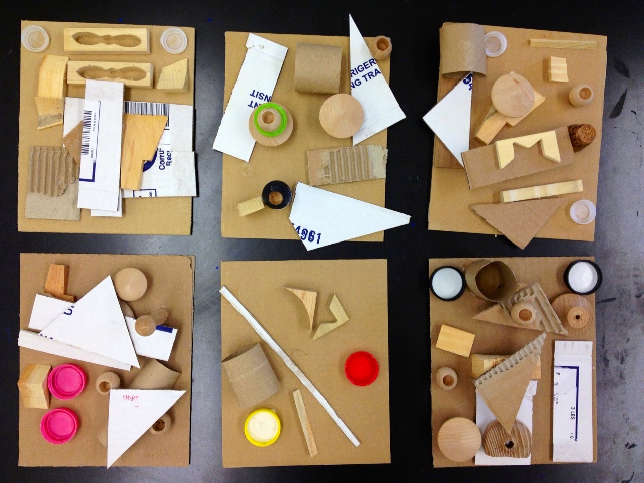
Students started with a rectangular piece of cardboard and selected a variety of different objects and materials to create their own assemblages. There were plastic bottle caps (thanks to all the families that brought them in!), cardboard shapes and scraps, as well as a variety of wooden pieces. Students could choose up to 2 bottle caps, 5 cardboard shapes, and 8 wooden pieces.
We used glue to help construct the assemblages. Students thought carefully about how to arrange their materials and considered how they might best fill up their space. Students also thought about layering materials on top of each other. 
 Here are some examples of our assemblages.
The following class, the assemblages had dried and were ready to be painted. We noticed that Nevelson painted her assemblages all one color, whether it was black, white or gold. We talked about why she chose to do this, and how this made it less distracting for the viewer and allowed textures and shapes to be the focus.
We chose one color to paint with and made sure to paint our entire assemblage, turning it around as we painted to make sure we got all the nooks and crannies! 
We also made sure to be gentle with the paint brush so materials would not fall off our assemblages. Here are some of the assemblages painted:


Some of our assemblages will be displayed in the glass case on the first floor near the lobby when all the classes are done painting, so keep your eye out for them soon!

Monday, April 27, 2015

Self Portraits from Observation

Many students had art class in their classrooms last month, due to state testing. Luckily, we were able to use the new standing self portrait mirrors recently gifted by the PTO. First, we talked about self portraits and how only you can make your self portrait (aka a selfie!). We noticed that everyone's eyes, noses and lips looked unique and different from one another. However, where they are located on our face is similar.

We measured the distance from the top of our head to our eyes, then shifted that down from our eyes to our chin. We noticed that this was around the same distance, since our eyes are actually in the middle of our head, not at the top. We also noted that the top of our ears are around the same point. And lastly, we took our hands and put them at the bottom of our ears and followed that down so we could feel the width of our neck. 
Then students set about drawing their self portrait from observation, using the new mirrors!
Students started with an oval shape for their head and drew a line across the middle and down the middle of this oval. These lines help provide guidelines for the placement of the eyes and ears, and also helped students to note the symmetry in their face.
Focusing on the shapes of their individual features, students looked closely at their eyes, noses and lips, as well as their ears and hair.
At the end of class, we shared what was most challenging part. Many students thought that the nose was the hardest feature to draw.
Gabriel, 2nd Grade

Cammy, 2nd Grade
Pirada, 2nd Grade
Aryman, 5th Grade
Gabby, 5th Grade
Erik, 5th Grade
Jasper, 5th Grade

Tuesday, April 21, 2015

Elizabeth Murray Inspired Shapes & Patterns

1st grade artists learned about the difference between geometric and organic shapes, after looking at a variety of different shapes. We then looked at the art of Elizabeth Murray, looking at and discussing her use of shapes.
Elizabeth Murray, Do the Dance (2005)
We noticed that Murray uses both geometric and organic shapes in her work, and her shapes and colors are fun and playful. They reminded students of a variety of different things -- from train tracks to a dog to the inside of our bodies! Students made many different connections to the artwork they saw.
Elizabeth Murray, Bop (2002-03)
After looking at Murray's work and reviewing shapes, students began by painting 2 geometric shapes and 3 organic shapes using black paint. The following class, we reviewed primary and secondary colors and also delved back into color mixing. Students painted their geometric shapes in primary colors and their organic shapes in secondary colors. They could choose any color or colors for the background.
The next week, students finished their paintings by adding interesting patterns, using a variety of repeating lines and shapes.
Students could also mix colors using black and white, so we explored pink and gray, among many other colors!
Here are some examples of our Elizabeth Murray inspired shape paintings: 
Kingston, 1st Grade
Ava, 1st Grade

Aiden, 1st Grade
Aysha, 1st Grade
Sawyer, 1st Grade

Wednesday, April 15, 2015

Thank You for Coming to the Art Show Reception!

Thank you to all the students and families who attended Monday night's Art Show Reception at the Watertown Mall! It was great to see so many Hosmer families supporting our artists. 
The Art Show is up at the Watertown Mall (near Target) until April 27th, so be sure to check it out before then!
Some of the artwork will also be displayed here at school, after the show gets taken down, so there will still be an opportunity to see the work after the 27th.


Monday, April 13, 2015

Monochromatic Tints Landscapes

Continuing with our study of value, 5th grade artists explored tints, which are made by adding white to a color. Students mixed white to a primary color, secondary color and tertiary color (which they also practiced mixing). The following class, they selected just one color to use for their tints gradient. Each student painted a piece of paper folded into 4 sections with tints of that chosen color. 
We then learned about the concept of atmospheric or aerial perspective, which can be seen in many landscapes. Basically, colors get lighter as things get further away from you. In addition, you can see more detail in the foreground and less detail in the background. 
We looked at some examples of photographs and paintings that demonstrate this concept.
Albert Bierstadt, The Rock Mountains, Lander's Peak (1863)
Students then sketched out their own landscape, deciding between a rural landscape and an urban landscape. The landscape included 4 layers, going from dark to light, with more detail in the foreground than background. After sketching, students drew their landscape on the back of each painted section of paper and cut them out before assembling and gluing them down as a collage. 
Many students went back and added more details by cutting out shapes from the leftover painted scraps of paper to make their landscapes more interesting. 
Lastly, students mixed their lightest tint and painted the remaining background. We learned that when an artist makes an artwork using different tints and shades of one color, this is called monochrome. We had a gallery walk of our finished monochromatic landscapes to see everyone's work. Here are some examples:
Taylor, 5th Grade
Alex, 5th Grade
Daniella, 5th Grade
Malcolm, 5th Grade
Lameh, 5th Grade
Ariana, 5th Grade

Friday, April 10, 2015

Self Portrait Assemblages

Recently, kindergarten artists learned about self portraits and drew their own self portraits using oil pastel. To further explore self portraits, students thought about what their bodies look like when they are doing their favorite activities. We shared ideas and students acted out different activities to see what their bodies look like when they are running, jumping, dancing, swimming, practicing ballet, doing karate and playing hockey. 
Next, students chose pre-cut cardboard shapes and glued them together to create their bodies, carefully considering the placement of their arms and legs during their favorite activities. 
During the following class, we talked about texture, or how something feels to touch. We thought of all the different places on our bodies that have texture. We noticed that our clothing and shoes had many different textures, as well as our hair. There were a variety of textured materials to choose from at the materials table, including paper, fabric, lace, felt, and buttons. Students chose different materials to add to their self portrait to give their clothing texture. 
Many students thought about what kind of clothing they wear during their favorite activity, to help select materials. Some students, for example, wear a uniform or special outfit for their activity.
At our last class, we discussed the different parts of our face and students added their facial features, as well as their hair. After everyone was done, we gathered on the rug to share our self portrait assemblages with the class. We noticed that there were such a wide variety of activities represented! Here are some examples:
Julia, Kindergarten - "I am running"
Luke, Kindergarten - "I am doing jumping jacks"
Ruthie, Kindergarten - "I am tap dancing"