Friday, January 30, 2015
Mixing and Naming Colors
Have you ever wondered whose job it is to name colors at Crayola? Or Benjamin Moore? Artists in 3rd grade mixed 10 different colors and also set about naming them, inspired by nature, food, and their surroundings.
First, students explored color mixing, trying to come up with 10 different colors. Since we had done our color wheel with primary, secondary and tertiary colors recently, students were familiar with which colors to mix together to get a wide range of colors. We also experimented with adding white to this mix, and students were able to mix many different colors.
After they dried, we thought of creative names for each color. Instead of simply naming colors "blue" or "pink," students were challenged to come up with creative names like "ocean blue" and "bubble gum pink."
Then we got partners by getting paint chips and having to find the person who got the same color. We shared our new paint colors with each other and shared our favorite color names. Some examples were names like "neon celery," "possessed pink," "patriots blue," and "scrambled eggs."
Check out some of our creative names for colors below!
Labels:
3rd grade,
Color,
Color Mixing,
Exploration,
Painting
Tuesday, January 27, 2015
Value Study
Henri Matisse, Still Life with Magnolia (1941) |
William Claesz Heda, Still Life with Oysters, a rummer, a lemon and a silver bowl (1634) |
We then learned more about value and the value scale, considering how to vary the pressure we use with our Ebony pencil to create a value scale that gradually goes from light to dark. We practiced this on our own and then tried to apply this to an actual object.
In order to practice drawing an object and applying these lights and darks, we looked at marshmallows! At first glance, they appear to be an all-white object, but when you look closer, there are areas that are lighter and darker on the marshmallow. Students identified the darkest area of the marshmallow as the bottom, where it sits on the table. The middle values could be seen on the edges of its rounded side, and the top was the lightest because the light source hit the top of the marshmallow first.
We drew marshmallows from observation, starting with a flat cylinder and adding value and shading to create a three-dimensional object on the paper. If students finished one view, they were encouraged to move the marshmallow onto its side and draw it from a different angle, paying close attention to the way the dark and light areas changed.
We will be continuing to study value and apply it in our artwork.
Labels:
5th grade,
Drawing,
Observation Drawing,
Shading,
Value
Friday, January 23, 2015
Rainbow Cityscapes
PK and Kindergarten artists have been learning about ROY G. BIV, or the colors of the rainbow! We watched a fun video about Roy G. Biv, a magical elf that helps us remember the colors of the rainbow. We noticed that each letter stood for a color, and they were in a certain order.
We went back to an art form that we explored in the beginning of the year -- collage! We used different colored paper to create different buildings, trying to make each building a different shape and size.
We spent one class cutting and gluing our buildings, thinking about different shapes and combining them to create taller skyscrapers. We also thought about overlapping some of our buildings, to make sure we had enough space.
During the following class, we finished adding our buildings and also used crayons to add details, such as windows, doors, building numbers, the sun, mood, cloud, snow and even people and snowmen! Here are some examples of our rainbow city collages:
We went back to an art form that we explored in the beginning of the year -- collage! We used different colored paper to create different buildings, trying to make each building a different shape and size.
We spent one class cutting and gluing our buildings, thinking about different shapes and combining them to create taller skyscrapers. We also thought about overlapping some of our buildings, to make sure we had enough space.
Arthur, Kindergarten |
Emma, Kindergarten |
Ella, Kindergarten |
Wednesday, January 21, 2015
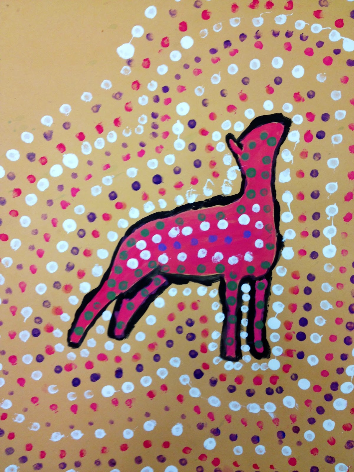
Aboriginal Animal Dot Painting, Part 2
Artists in 4th and 5th grades finished their Aboriginal Animal Dot Paintings before winter break, adding dots to the background around the body of their chosen animal (and listening to more didgeridoo!). We then spent a class discussing, looking at and reflecting on our artwork.
We did this in 3 different ways: a turn and talk, gallery walk, and written self assessment. For the turn and talk we partnered up with classmates and used fortune tellers that were made especially for talking about artwork. They work similarly to regular fortune tellers, except instead of fortunes, they ask questions about your artwork. They acted as a tool to help jump start our conversations so we could reflect on our work and tell each other about our artistic choices.
Next was the gallery walk. We walked around the room quietly, going from table to table to see each other's artwork. We shared observations that we noticed from each other's artworks and it was interesting to see that they all came out very differently!
Among many other things, we noticed that some students used bright colors and some used colors that were more natural for the animal, the space between the dots varied, and some students added patterns to the animal's body.
The last part was a written self-assessment to reflect on our artwork. We had to consider whether it met the criteria we had been working on, including featuring an Australian animal, using at least 5 mixed colors, and creating a pattern with the dots. Students were able to think back to the responses they had during the turn and talk to answer some of the questions, such as "What are you most proud of in your artwork and why?"
Students took their time to think through the questions and reflect on their work, which was evident in their completed self-assessments. It was interesting to read that several students had a personal connection to the animal that they chose, whether it was as a pet or having seen the animal on a trip.
Students were most proud of the range of colors that they mixed and how carefully they painted their animal. The most challenging part of this project was definitely the dots! As one student wrote, "sometimes the q-tips just did not cooperate with you." It was also challenging to mix the same color for the dots in order to repeat the pattern.
Some of the paintings will be up in the glass case downstairs on the first floor soon, so look out for those. In the mean time, here are some examples:
Sadie, 5th Grade |
Among many other things, we noticed that some students used bright colors and some used colors that were more natural for the animal, the space between the dots varied, and some students added patterns to the animal's body.
The last part was a written self-assessment to reflect on our artwork. We had to consider whether it met the criteria we had been working on, including featuring an Australian animal, using at least 5 mixed colors, and creating a pattern with the dots. Students were able to think back to the responses they had during the turn and talk to answer some of the questions, such as "What are you most proud of in your artwork and why?"
Saleena, 4th Grade |
Eleni, 5th Grade |
Ashley, 4th Grade |
Anas, 5th Grade |
Kelsey, 4th Grade |
Catherine, 5th Grade |
Esmeralda, 4th Grade |
Thursday, January 15, 2015
Color Wheel Snowflakes
Recently artists in 2nd and 3rd grade have been exploring color and color mixing. In 2nd grade we painted color wheels, using the primary colors and mixing our secondary colors. Third graders also painted similar color wheels but they also mixed an additional set of colors called tertiary colors, combining the primary and secondary colors to create these intermediate colors.
We noticed that the color wheel is organized in a way that helps you remember which 2 primary colors make a secondary color, because it is located in between the 2 primary colors that you need to mix:
3rd graders used a color wheel that included tertiary, or intermediate, colors:
For the tertiary colors, students had to consider how much of one color they should use to get red-orange vs. yellow-orange. We noticed that the names of the tertiary colors give you a clue about what colors you need more of. We tested some of our color mixes to make sure we had the color we wanted.
After the color wheels dried, we learned about the concept of radial symmetry, which can be seen in nature. Radial symmetry is symmetry around a central point. We looked at images of snowflakes under a microscope to see how each snowflake had radial symmetry in its design, and are all unique and different.
We learned how to fold our cut out color wheels, starting with folding it in half like a taco and eventually folding it into an ice cream cone shape. We then cut out a variety of shapes, making sure to leave a little space in between our shapes so our finished snowflake would not fall apart. Then it was time for the big reveal as we opened our snowflakes to see our intricate, unique and radially symmetrical designs!
We chose a black or blue background and glued our snowflakes on top.
Examples from 3rd grade will be displayed in the connector hallway soon, so keep your eye out for our color wheels transformed into snowflakes!
Cicily, 3rd Grade |
Sidney, 3rd Grade |
Nikolas, 3rd Grade |
Tiffany, 3rd Grade |
Subscribe to:
Posts (Atom)